
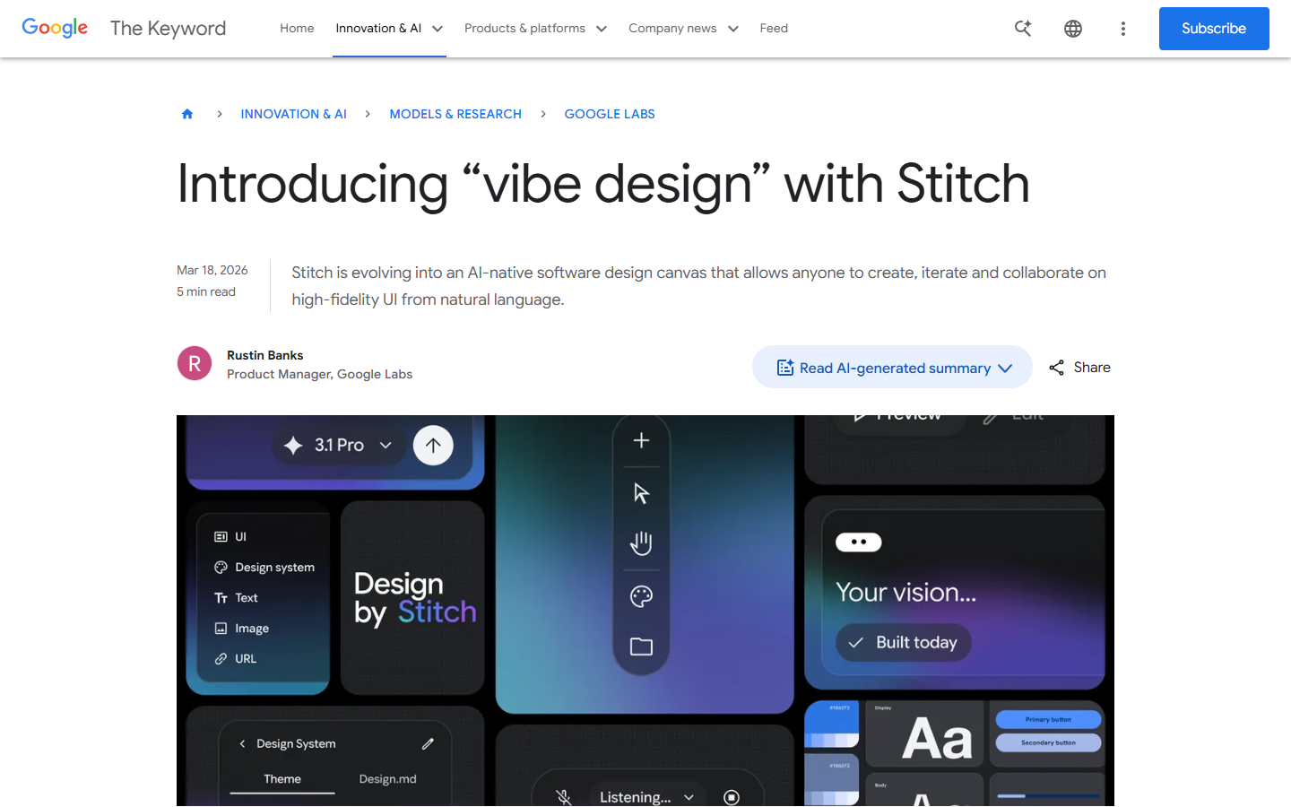
About a year ago, Andrej Karpathy posted a tweet that would reshape how people talk about building software, describing a workflow he called “vibe coding” where you stop reading the code, stop reviewing the diffs, and just tell the machine what you want in plain English until something functional appears on your screen. That tweet picked up over five million views and turned “vibe” into the default prefix for any workflow where AI does the heavy lifting and humans do the pointing and hoping. Now Google has taken the same idea and applied it to design, launching a fully rebuilt version of its Stitch tool on March 18, 2026, and coining a new term in the process – “vibe design.”
I have spent the last few days testing the new Stitch, reading through the community reactions, and trying to figure out whether this is a genuine shift in how design gets done or just a clever rebranding exercise. This Google Stitch review is my attempt to lay out what works, what does not, and who should actually care.
What Google Stitch Is and Where “Vibe Design” Came From
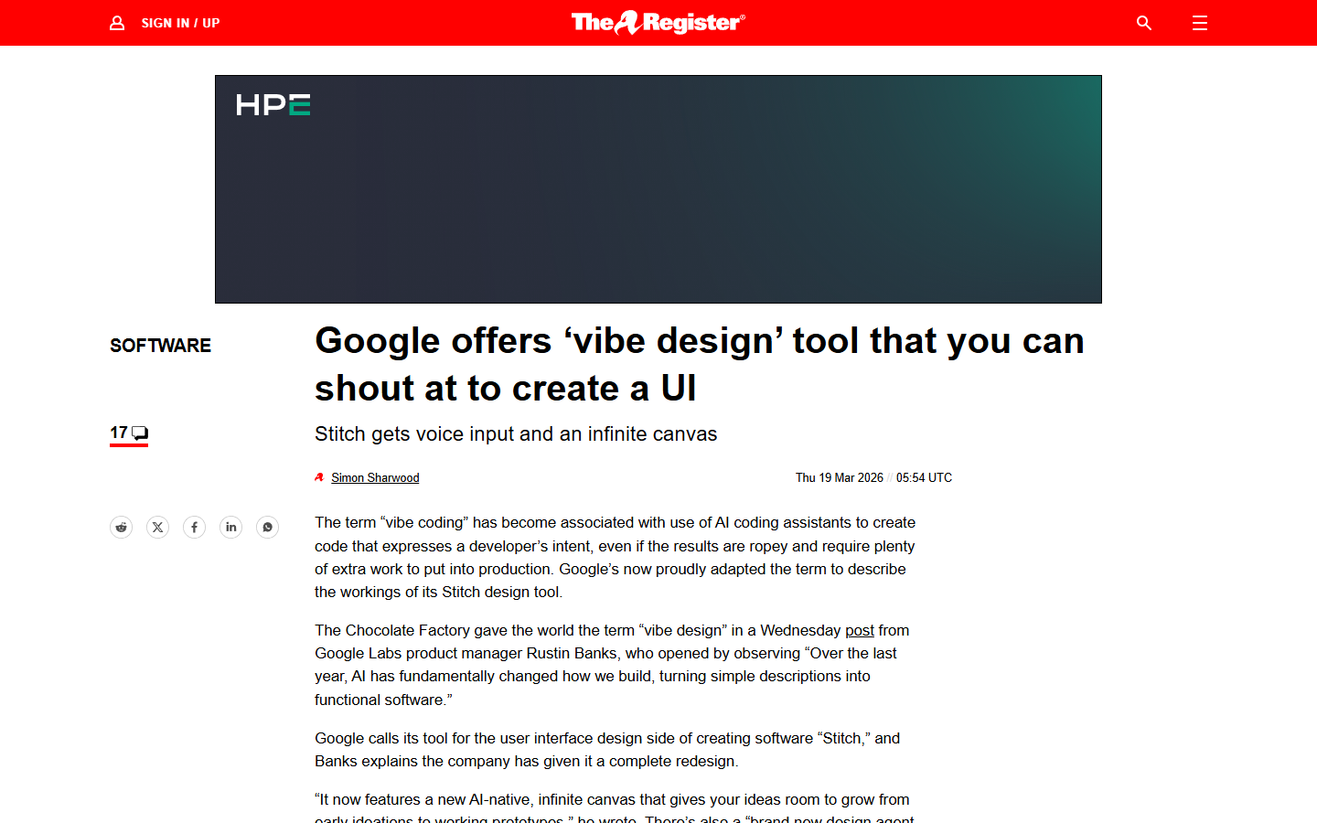
The original Stitch launched in May 2025 as a fairly limited tool from Google Labs – you could describe a screen in natural language and it would generate a single UI design, which was neat but felt more like a demo than a product. The March 2026 redesign changes that substantially, replacing the fixed artboard interface with an AI-native infinite canvas, adding voice control, introducing one-click prototyping, and wiring up developer integrations through an MCP server and SDK.
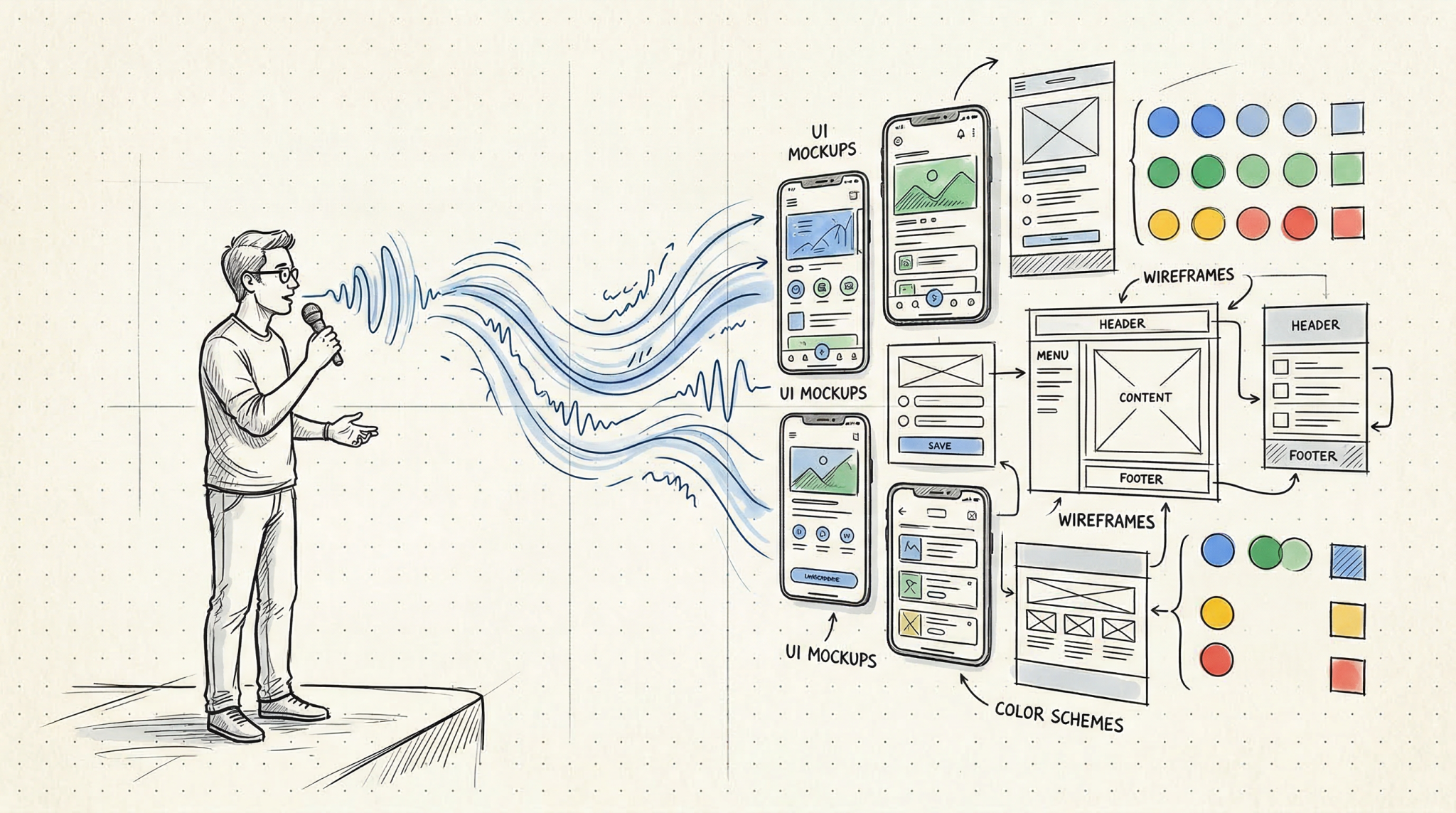
The “vibe design” label is Google’s explicit attempt to borrow Karpathy’s framing and port it from code to visual design. Rustin Banks, the product manager behind Stitch, described it this way: instead of starting with a wireframe, you start by explaining the business objective, what you want your users to feel, or examples of what is currently inspiring you, and then the AI generates high-fidelity UI compositions from that intent. It is the same leap that happened in best vibe coding tools over the past year – the input changes from precise technical specification to a loose description, and the machine fills in the gaps.
Worth noting that Stitch is entirely free right now – no paid tiers, no credit card, just a Google account and access to stitch.withgoogle.com. SiliconANGLE confirmed it is available through Google Labs at no cost, though there appear to be monthly generation limits (roughly 350 in standard mode and 200 in experimental mode based on earlier documentation, though Google has not confirmed whether those caps changed with the redesign). TechRadar noted the company has not said whether pricing will eventually be tied to AI token usage, so the free access is worth enjoying while it lasts.
Getting Started – What the New Stitch Actually Looks Like
The first thing you notice is the canvas itself, which feels closer to a Miro board than a traditional design tool. You can drop images, text descriptions, and code snippets anywhere on the workspace and the AI agent processes all of it as context for whatever you ask it to generate. There is an Agent Manager panel that tracks every design task and variation, and you can click any task to jump directly to the relevant screens, which is a small detail that becomes genuinely useful once you have a dozen variations scattered across the canvas.
The generation process is straightforward – describe what you want and Stitch produces up to five different screen ideas simultaneously. You can then point at any screen and refine through conversation, telling the agent to swap the navigation layout or add a section you forgot. The agent sees the full canvas, so contextual references like “make that header match the style from the other version” actually work, or at least that is how it has worked for me across about a dozen test projects so far. The underlying model is Gemini 2.5 Pro, and outputs come as production-ready HTML and Tailwind CSS with optional Figma export.
Here Is What Stitch Gets Right
The Infinite Canvas Is Genuinely Useful for Exploring Ideas
The canvas is the feature that matters most in my experience, even though voice control and prototyping get more attention in the press coverage. The old Stitch forced a one-screen-at-a-time workflow, meaning you were constantly making decisions before you had enough options to compare. The new canvas lets you generate five homepage concepts, park them next to each other, and ask the agent to combine elements from two into a sixth variation – all without leaving the workspace.
The Techloy breakdown covers this well: the agent now processes the full canvas rather than isolated screens, which means project-wide operations actually work. Upload a logo to one screen and the agent can propagate it across every other screen, or ask for a mobile version of your desktop layout and it generates the responsive variation right next to the original. This is the kind of thing Figma does through component instances, but Stitch does it through conversation, which is a fundamentally different (and in some ways faster) interaction model for the exploration phase.
Voice Control Feels Like the Future (When It Works)
Voice launched in preview mode with “fast improvements coming in the next few weeks,” which is Google’s way of managing expectations while still generating headlines. When it works, it is genuinely impressive – you can talk through layout changes while looking at the canvas, issue concurrent commands like “change this screen to a darker look, make three different menus, and show me the dashboard,” and the system processes them simultaneously rather than queuing them up.
One user on r/aicuriosity described it as “being able to verbally discuss layout adjustments while viewing the canvas is something I didn’t realize I was missing,” which I suspect captures the reaction most people will have. I should mention the voice feature is clearly early – I had originally planned to test it more extensively, but the latency and occasional misinterpretation made it more of a promising demo than a reliable daily tool at this point.
The MCP Integration Changes the Workflow
This is the part most reviews skip over, but in practice it matters more than the flashier features. Stitch now has an MCP server and SDK connecting it to developer tools including VS Code, Cursor, Claude Code, and Gemini CLI. In practice, this means you can design in Stitch, export your design system as a DESIGN.md file (an agent-readable markdown format covering fonts, spacing, colors, and component styles), and have your coding agent consume that file to generate matching components.
The DESIGN.md format parallels similar moves in the coding world like claude.md and spec.md files and creates an interoperability layer between design and development that has not existed in this form before. You can also paste any website URL into Stitch and extract a design system from that site, which is the kind of competitive research shortcut that founders will absolutely use even if professional designers find it reductive.
Where It Falls Short
Output Quality Is Not Figma-Level Yet
This is the honest part of the Google Stitch review. The designs Stitch produces are impressive for AI-generated output, but not at the level a trained designer would produce in Figma. One designer testing it for a conference app reported on r/UXDesign that it “produced five screens, but none of them stood out as exceptional” with “a lack of consistency in both layout and typography.”
The r/FigmaDesign community was more blunt: “It provides minimal value for seasoned designers” received 61 upvotes, which tells you where the professional design community stands. The gap becomes obvious when you need multiplayer collaboration (Stitch is single-user), a plugin ecosystem (Figma has 2,000-plus, Stitch has none), or enterprise features like SSO and org-level admin. As NxCode framed it, Stitch dominates the zero-to-one phase while Figma dominates the one-to-hundred phase of refinement and production handoff.
The Homogenization Problem
This critique applies not just to Stitch but to the entire vibe design concept. Yahoo Tech raised it directly: “when you simplify the creative process this much, there’s a risk people lean on familiar styles instead of pushing new ideas, and that could leave us with apps that all look and feel alike.” When everyone uses the same Gemini-powered model to generate interfaces, you risk a wave of safe, algorithm-shaped designs that check all the right boxes but lack personality.
This is valid, I think, but somewhat inevitable – the same concern exists with vibe coding tools, where AI-generated code gravitates toward certain patterns. The question is whether the speed gains are worth the trade-off in originality, and for most people Stitch targets – founders, marketers, developers who need a design starting point -, I suspect the answer is yes.
How It Compares to Figma, v0, Replit, and Lovable
These tools are not all doing the same thing, even though they get lumped into the “AI design” category.
Figma remains the professional standard. It costs $12 to $90 per seat per month and has the depth of control production design requires. Its stock dropped 8.8% the day after Stitch launched (per Intellectia.ai), and the real danger, as NxCode noted, is that Stitch intercepts the next generation of users before they ever learn Figma.
v0 by Vercel generates production-ready React and Next.js components, deploys to Vercel instantly, and syncs with GitHub. It is component-first where Stitch is design-first. The NxCode three-way comparison suggests using Stitch for design exploration, v0 for component generation, and Lovable for full-stack assembly.
Replit Agent 4 also features an infinite canvas, but code-integrated rather than design-focused. Our Replit Agent 4 review covers this in depth – the key difference is Replit builds the entire app while Stitch is design-only.
Lovable takes the most aggressive position, going from plain-English descriptions to fully deployed full-stack apps with over 10,000 custom domains already connected. Better deployment, but Stitch gives better design quality.
Who Should Use Google Stitch (and Who Should Wait)
Stitch is a good fit if you are a founder prototyping an idea, a developer who needs a design starting point but does not want to learn Figma, or anyone on the AI tools for content creators spectrum who has design needs but not a design budget. Free and requiring nothing more than a Google account makes it an easy recommendation for exploration work.
You should probably wait if you are a professional designer who needs precise production-level control, if your team needs real-time collaboration on design files, or if you need enterprise features. Stitch is still a Google Labs experiment, and relying on it for client deliverables carries the risk that Google changes the product or introduces pricing without much warning.
There is also a middle ground that is worth considering: using Stitch for the first thirty minutes of a project and then exporting to Figma for refinement. Elvis Hsiao wrote on uxdesign.cc that a quick session produced “production-ready wireframes that have cohesive styles and layouts” in about five minutes – not bad for a free brainstorming accelerator.
The Bottom Line
The Google Stitch redesign does what it promises – it lets you describe a design in natural language and produces high-fidelity UI compositions good enough for prototyping, brainstorming, and early-stage exploration. The infinite canvas, the voice control (despite its preview-mode roughness), the DESIGN.md format, and the MCP integrations all point toward a workflow where the first phase of design becomes dramatically faster than it has been.
It is not a Figma replacement, and Google does not seem to be positioning it that way, at least not yet (though the stock drop suggests investors are reading ahead). What it amounts to is the design equivalent of what Cursor and Replit did for coding – a tool that makes the initial creative leap cheaper and faster, shifting the hard work from “getting something on the screen” to “refining what is already there into something distinctive.”
The “vibe design” label is, of course, partly marketing – Google borrowed a term that was already resonating and applied it to a new domain. But the underlying capability is real, the price is right, and the developer integrations suggest Google is building toward something larger than a standalone design toy. The tool is still early, the generation limits will matter once you are deep into a project, and the output quality has room to grow – but the direction is clear. Keep an eye on this one, particularly as Google I/O 2026 approaches and more features are expected to land.
Keep Reading
- The 8 Best Vibe Coding Tools in 2026 – A full breakdown of the tools powering the vibe coding movement that inspired vibe design
- Replit Agent 4 Review 2026 – Another infinite canvas approach, but focused on building complete apps from design to deployment
- AI Tools for Content Creators – The broader landscape of AI tools for non-technical creators, including design and prototyping options
